York United Football Club — formerly York9 FC — launched its newly-designed identity on Friday afternoon at a virtual unveiling event, featuring club chairman Mike Baldassara, president and general manager Angus McNab, and Canadian Premier League Commissioner David Clanachan, and hosted by soccer personality James Sharman.
On top of the new name, York United revealed a brand new primary crest, secondary marks, and a special Nine Stripes Edition jersey to be worn during the 2021 CPL season.
York United Rebrand: 4 things you may have missed || Rebrand Q&A with Angus McNab || 9 moments from York9 era
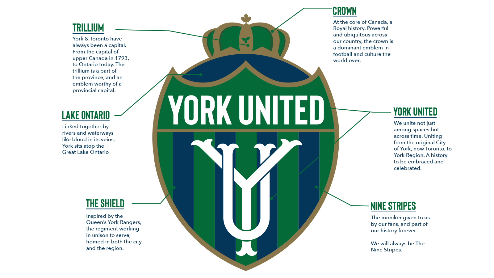
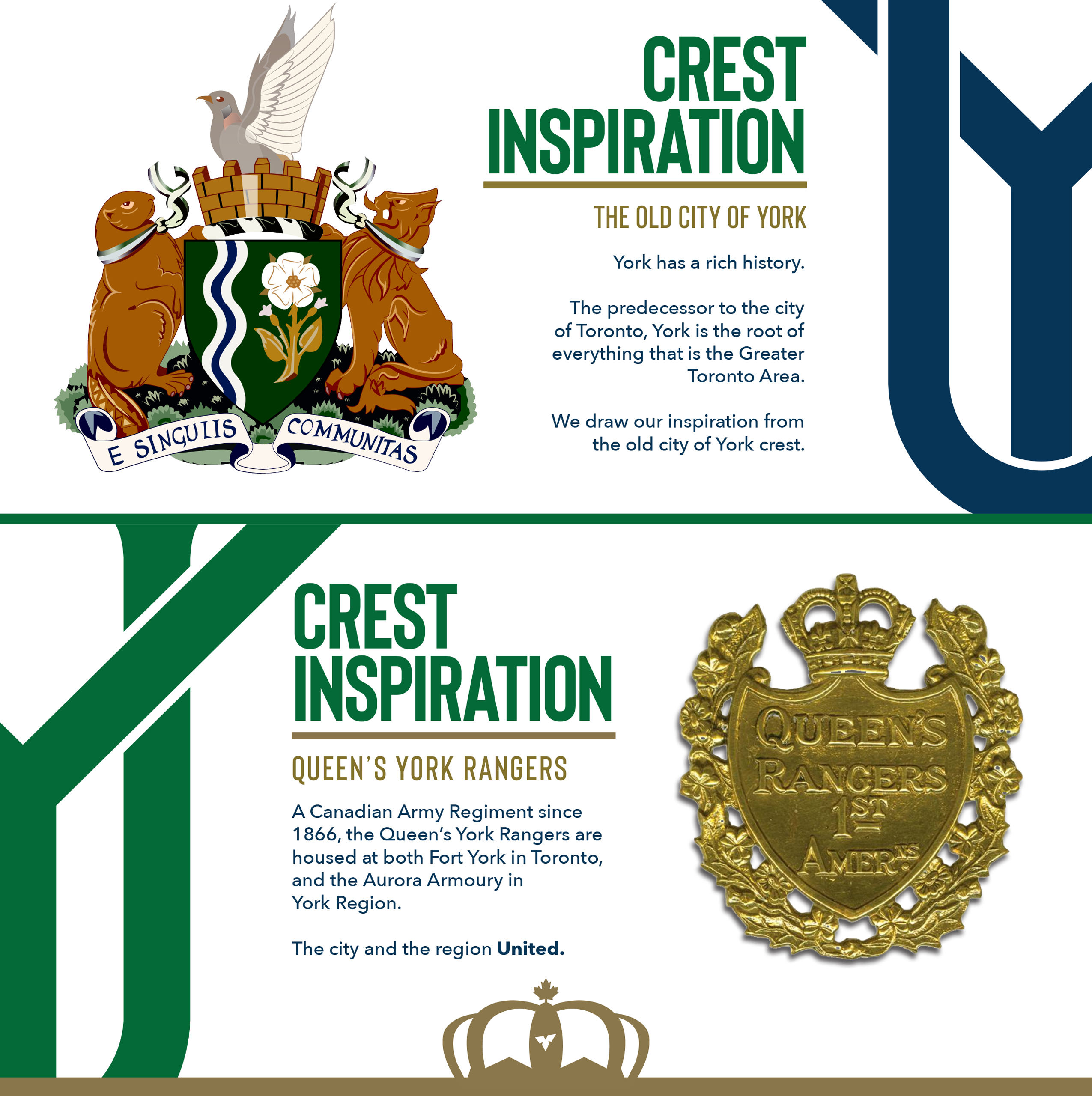
The club’s new official colours are York Green, Lake Ontario Blue, Trillium White, and Victory Gold, all of which feature on the new badge and kit. The crest, inspired by local history including the old City of York crest and the Queen’s York Rangers Canadian Army Regiment (which is based both at Fort York and in Aurora), retains the characteristic Nine Stripes that gave the club its nickname in its first two seasons in the CPL.
The new identity, which is the result of extensive research and consultation with supporters, is intended to help connect the club with soccer fans across York Region and Toronto, aiming to create something that people can get behind across the GTA.

“This is a hugely exciting day – not just for us but for Canadian soccer generally,” McNab said in a statement.
“What I’m especially proud of is the way this has come together. At the core of this entire process has been people who care: supporters who we engaged in many frank discussions with, and staff who’ve been here from the very start. They are so passionate about this game, the potential of this team and this community. Their insight was invaluable and it was a patient, measured approach. You cannot be flippant about something so important to so many. It needed to be careful and meticulous and we’re grateful to the Canadian Premier League and our owner Mike Baldassarra for believing in us.”
McNab continued: “Sometimes change is hard. But the key message here is that we take it on together and share in the exciting possibilities ahead. ‘York United’ perfectly captures our organization. We are an inclusive, warm, welcoming place and solidarity is crucial to this new chapter. But this isn’t just about a name. This is about who we are and what we want to represent. There is a connective tissue that binds York, Toronto and the GTA and we can’t simply ignore that. We are not just a number. We are bigger and better. We are united by a desire to progress and an ambition to be more.”

Although a special-edition striped jersey was revealed on Friday, McNab explained that the club will be continuing with white as its primary kit colour, indicating that another new home uniform will be unveiled in the coming months.
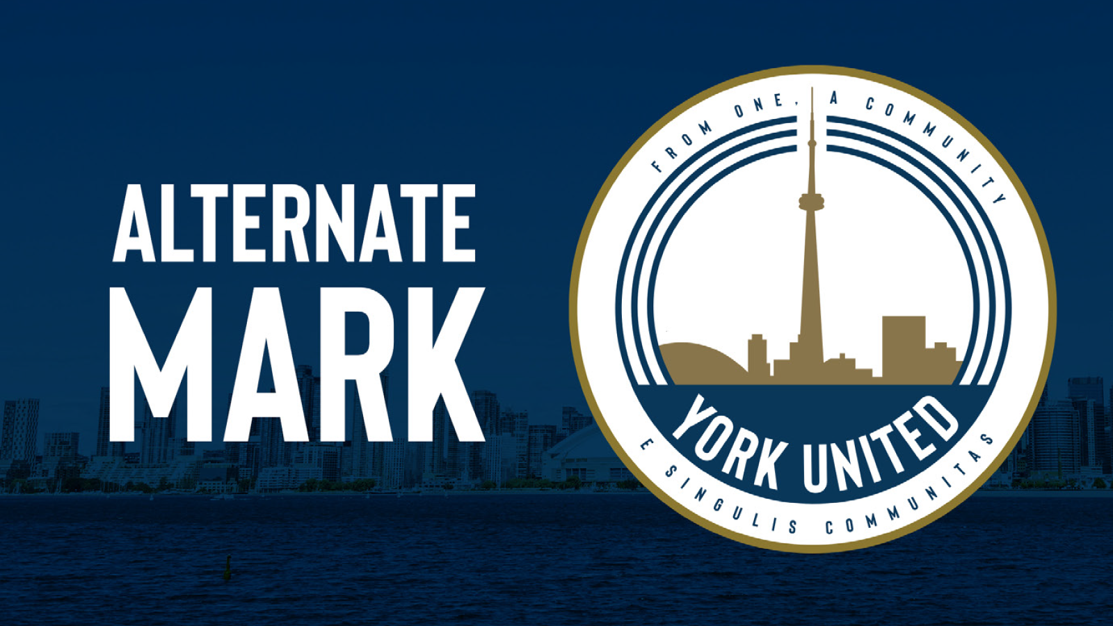
York United also unveiled new alternate marks, including one featuring the iconic Toronto skyline and a three-ring reference to the three rivers (the Humber, Don, and Rouge) that flow from York Region into Lake Ontario. The announcement of the rebrand was accompanied by York United’s new campaign video, United By You, with narration by well-known Canadian actor Jay Baruchel, directed by Montreal cinematographer Marc Lamy.

“The league’s goal is to be innovative, creative and adaptable,” CPL commissioner Clanachan said.
“For York United Football Club, based on what we have learned about their fans, supporters and the overall community, we knew it was important to listen and continue to evolve the incredible brand we started in York Region in 2018. We are proud of the outcome that we feel represents a fresh new look that aligns with our goal of always being innovative.”
The club’s new identity takes effect immediately, and the new crest and colours will first hit the pitch at York Lions Stadium when the 2021 CPL season begins.
More information about the redesign is available at York United’s new website, yorkunitedfc.ca.


